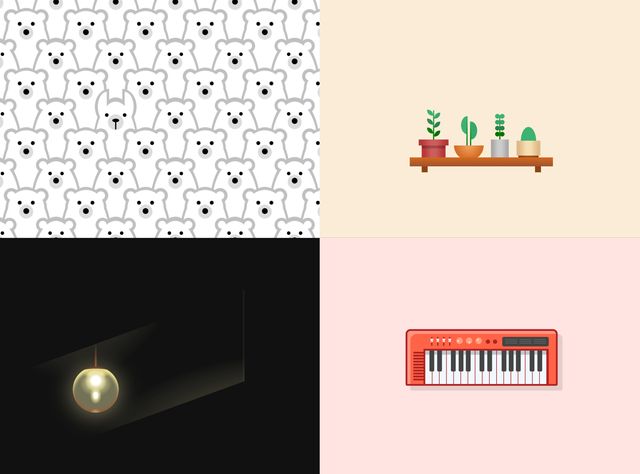
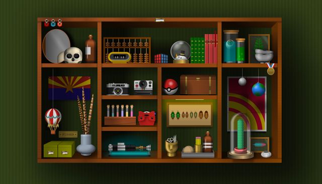
I’ve always enjoyed the CSS art people create, but I’ve never ventured into it much myself. I’m familiar with many of the tricks involved, but still find it surprising every time: the way people are able to make such fluid and beautiful images out of little boxes. I always end up digging around in dev tools to see how things are done, but I had never seen the process unfold.
Any time CSS art starts getting attention, there is always someone around to say “that’s not practical” or “just use SVG” or something similarly dismissive and boring. It’s a terrible argument, even if it was true – no one is required to be Practical At All Times. What a terrible world that would be.
In October, I took the time to watch
Lynn Fisher
(Twitter,
CodePen),
one of my favorite CSS artists,
live-stream her single-div process.
Somewhere in the back of my mind,
I assumed single-div artwork
relied on highly complicated box-shadows –
almost a pixel-art approach.
I’m not sure where that idea came from,
I probably saw someone do it years ago.
But her process is much more “normal” and “practical” than I even realized:
a number of reasonably layered, sized,
and positioned background gradients.

Wait. I know how to do that. It’s not the technique that’s magical – it’s the audacity of turning a few gradients into a block of cheese with cake inside!
I’ve used all these properties before on client projects. I’ve created gradients, layered images, sized them, and positioned them for various effects. None of that is new, or complicated, or radical. I really didn’t learn anything at all about the CSS itself. But it had a huge impact on my perception of what I could accomplish with those simple tools.
Within a few weeks, I was using that in production. Again, it’s nothing fancy or complicated – the perfect low-hanging fruit where a custom SVG feels just slightly too bulky. Here’s the effect I created, for a personal project, with a few custom properties to make adjustment easier:
See the Pen CSS gradient-art decorations by @undefined on CodePen.
Last week we used a similar trick as part of a Very Practical & Official client component library. It was Stacy’s idea, and it worked great.
Thanks Lynn, and all you other fabulous CSS Artists! Thanks for showing us all how much farther we can push this language that we love so much, and the Very Serious tools we use every day.
