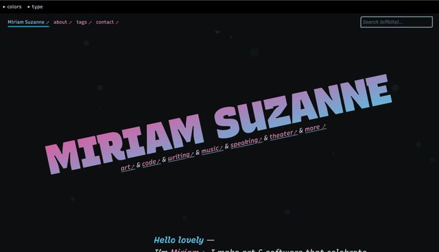
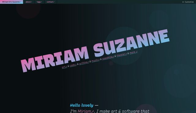
Can I really call it a ‘no-demo’ reno, when I keep moving all these files around? I don’t know. Maybe? It was always going to be a tenuous metaphor. What if I just tear out all the walls, and design an open-concept site?
When I asked Erin to comment on a new idea for navigation, she said –
It doesn’t matter how you organize it, you’ll never be happy with the result. The problem isn’t the navigation. You just can’t decide what the site is for.
Why did I make this site in the first place?
I started building websites as a way to market my first theater company.[1] It was a place for the audience to see what’s playing this season, or find the (web 1.0) phone number for tickets. There were clear reasons for people to show up at our site, and a clear set of goals for them to achieve.
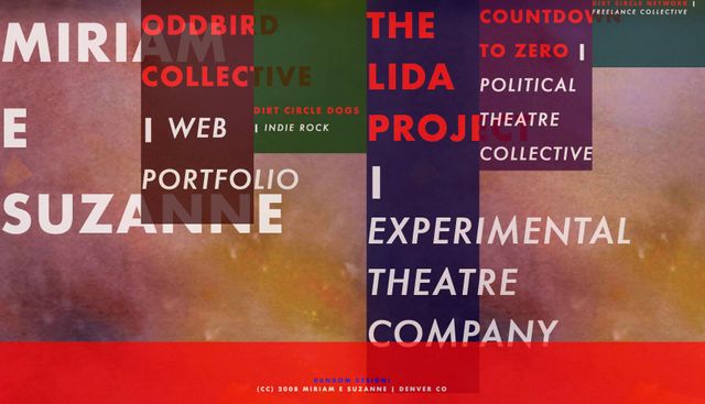
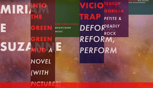
My personal sites have taken a number of different forms. For several years I had a one-page ‘business-card’ website. Short and simple. My name, a few links, and some aggressive aesthetic choices:
There’s something refreshing about a single-page site. All it has to do is send you somewhere else, with a bit of flair.[2] Meanwhile, the target sites each have a clear focus defined by the brand and goals of the project.
But in 2012 I got frustrated, and it’s been all downhill from there.[3]
Another theater company had recently imploded from internal conflicts. I was looking for new ways to get my art out, and become part of a local scene. I was also actively looking for a publisher. To do that, I would have to sell myself better. I wanted to have more of a ‘presence’ online – to move from lurking to participating.
I built a new website on Tumblr.[4] It was meant to be a digital resume/portfolio, and also a place to write more, and interact directly with a (very small) audience. There was a blog on the front page, and a page for those same project links. One publisher asked me for an artist manifesto, so I included that as well.
Some things change, some things don’t
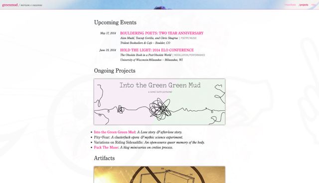
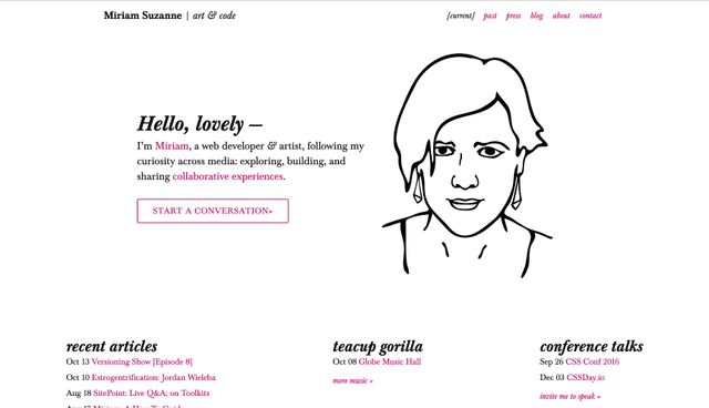
The earliest styled archive I could find is from 2014, when I moved off Tumblr:
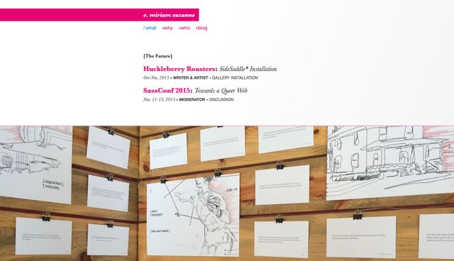
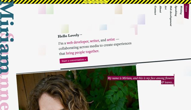
Since then, it seems like I’ve redesigned the site every couple years. For a while the navigation became more and more complex:
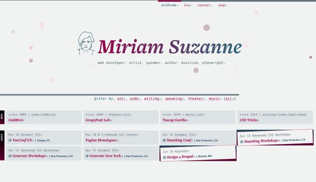
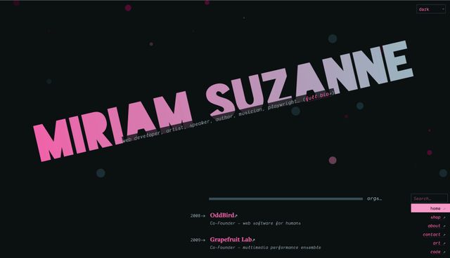
Until 2019, when I removed all the navigation and moved onto Eleventy. I was tired of trying to sort my life into a nav hierarchy. The new design would rely on tags instead:
It’s interesting to look at those last few years. It seems I’ve been struggling to determine what belongs in ‘navigation’ vs ‘filtering’, and how to highlight the most relevant content… while treating everything as equal.
That’s what really strikes me – the sameness of all the content. It doesn’t matter if you’re looking at a blog post, or a new album, a book, a theater production, an open-source project, or a talk that I’m giving next week. There’s no distinction at all.
As a reaction against trying to categorize my content, I removed any distinctions at all. Everything is a card on a timeline. Every card has a title, a date, a summary, and some tags.
The objects of my desire
Over at OddBird, Sondra has been using Sophia Prater’s Object Oriented UX as a guiding philosophy for our design process.
I’m not an expert on the approach, but the guiding principle is that humans have an object-oriented perception of the world around us. When we walk into a room, we quickly process objects like tables, chairs, couches. We recognize their familiar shapes, and understand how they can be used.
In an Object-Oriented UX, we can aim for a similar object-recognition:
- A given site ‘object’ ought to be recognizable no matter where it appears on the site.
- Different objects ought to be distinct from each other.
Ha. Well, oops.
I’ve started to create a short list of object types like posts, books, albums, orgs, scripts, talks, etc. I thought maybe, in addition to distinct styling, those objects could form a new sort of navigation. But right away, they started overlapping and falling apart. That’s when Erin stepped in to dismiss the entire idea.
All those things do exist on my site, and may deserve styling consideration, but they’re still basically just tags. And they’re tags that I already use. I think, in a sense, they’re too specific to provide a more clear understanding.
Looking back at previous versions of this site, I’m struck by the original ‘objects’ that I used for navigation from 2012-2016. They fit smoothly with my more recent thought that this site is both an archive, and a live event:
By archive, I don’t mean content that is out-of-date, but content that exists here as a sort of documentation – a record of my life and work elsewhere:
- Organizations (OddBird, Teacup Gorilla, CSSWG) that I work with. In 2014 I called them co-belligerents.[5]
- Artifacts that are the result of my/our work, like albums, books, specs, and open source projects.
- Events past, present, and future. These also tend to have two parts – the script/talk which can be performed multiple times, and the individual performances.
By live event, I mean content that exists for itself – intended to show up on a website, in a feed, not as an avatar of something else:
- Posts that I write.
- Links that I want to share.
- Announcements about upcoming archival stuff. I wrote a book, or I’m giving a talk, or whatever.
I think these categories start to get at something more useful, or informative about what this website is and how it works.
Of course this isn’t unique or original, beyond (maybe) the language I use. Most content management tools are organized around posts (feed), and pages (archive) – with special handling for calendar events, and products (artifacts).
But why, though?
I still haven’t addressed Erin’s critique.
Over the last 8-10 years – since I moved away from the single-page approach – I’ve tried to re-imagine the content architecture and navigation of this site multiple times. But I’m not sure I’ve spent much time reflecting on the purpose of the site.
The other day, someone on Twitter told me:
The homepage should always be a selling point. It doesn’t matter if it’s selling yourself personally or the value of your blog. To be blunt, no one who landed on your personal site got there because they care about you personally.
I’m not sure that’s entirely accurate. I do actually have friends and family who care about me, and also look at my site. They just go to a different school. You wouldn’t know them.
But in 2012, selling myself was front-of-mind. I needed a resume and portfolio of my experience and expertise, because I needed work. A times, I’ve also tried to sell the results of my work. The artifacts. Books, albums, prints of my art, etc.
Both of those are reasonable objectives for a personal site with a sales pitch. But it’s also reasonable to have a personal site that acts as more of public journal – entirely unrelated to selling. A site entirely dedicated to the people who care about me personally.
It would be reasonable to have an entirely unreasonable website, just-for-the-fuck-of-it. Often, my site is just where I play around with ideas. Or it’s an extension of my social life online – which includes work, but isn’t limited to work.
I don’t need this to be a professional site. That’s why I have OddBird.net, TeacupGorilla.com, and GrapefruitLab.com. This site can be anything I want. Parts of this site are very personal, and not at all appropriate for a professional resume or portfolio.
This is my home, online. Sorry for the mess. Can I get you a glass of water?
Robin Rendle, who has continued to inspire this redesign, seems to be thinking through some similar questions (in much more concise posts).
About the redesign is an excellent reflection on their process so far – what’s working, and what isn’t. Then also, All the things a post can be:
Saccharine, careless, melancholic, naive, questioning, questionable, dashing, daring, and vengeful. Inquisitive. Soaring! Doubtful, distrustful, apprehensive, hesitant, unready, unabridged, undecided, unwavering. Woeful. …
It goes on. I love it. An expansive set of options, all interesting in their own way. I wonder what a website can be?
I don’t have an answer to this, exactly. But I know that some of my own conscious and unconscious goals come from a joy of making and sharing, and some of them come from fear.
Irrelevance maybe? Unemployment?
I’ve built my life around a willingness to turn down better-paying jobs in order to protect my voice and my time. But the flip side has been a rollercoaster of self-employment highs and lows, and a fear that I need to always keep selling.[6] Sometimes that’s been a helpful motivation, but I don’t think it’s as relevant now as it was in 2012.
There are many ways for a career to crumble, but I think mine has become about as stable as I could hope for.
What can my website be?
Erin will tell you that the reason I find this difficult is because I’ve been trying to do all of the above and more. I’ve been trying to document my entire existence, and organize it into a simple site navigation.
Is that unreasonable? So be it.
I think one goal of this redesign has to be prioritizing my own joy of making and sharing – wherever that takes me. But I still want to step back, and think through the implications.
I’m reminded of the criteria that Abigail Thorn uses to guide episodes of Philosophy Tube:
- Is it made from curiosity, not ambition?
- Is it made out of compassion for myself and others?
- Is it my unique creative vision?
Anne Bogart also has a set of questions for defining the boundaries of a theater piece. I use these prompts often when I start on a new writing project:
- What is the question that motivates the piece?
- Who or what is the anchor through which we explore the question?
- What is the structure of our exploration?
Some things to think about. Quoting Robin again:
I guess the reason why it’s so hard to make an about page for me is that the goal is so murky. What do I want folks to get out of this? I guess a photo of me, an email address, and then…what exactly? Ugh.
All that to say, Erin has a point. Which is rude.
A simple ‘database’ of shows – hand-written CSV files – with a PHP script to give me server-side includes. My own proto-Eleventy. ↩︎
Ted Nelson calls web links a diving board into darkness. He means that as an insult, but I think it sounds rad. ↩︎
If you’re on a bike, downhill is a good thing. Are we on a bike? ↩︎
Cameron Moll had just moved onto Tumblr at the time. I think that was the inspiration. ↩︎
This is a phrase that I saw on a historical marker for a failed political uprising. I don’t remember the details, only the phrasing. ↩︎
I would like to sell you my mediocre personality, and terrible humor. These aren’t my best qualities, but you can have them both for only
$9.99$4.99 and a back-link.) ↩︎
